Wednesday 19 December 2012

Killing silence poster

I have created a film poster of my own.

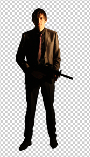
I started off by taking a picture of myself in a suit posing. this was the picture I chose to use in my poster


To make it fit in I took away the background by using the 'quick selection' tool then got rid of the background.
I then got a background off Google then put myself into the scene of it and put myself at a reasonable size so I fit in. Luckily the colour of me matched the colour of the background image.
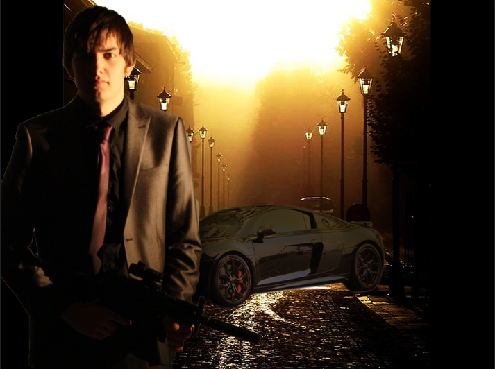


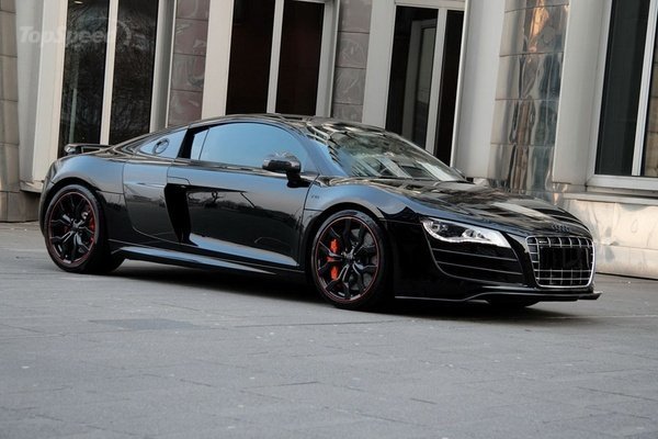
I then got an image of an Audi r8 off Google because it's a good car and fits into the theme of my film, I got id of the background using the 'pen tool' to go round the car then putting it into the image of me with the background


I then put the Audi in the background, flipped it so it fit in and changed the colour. To change the colour so it fit in I changed the colour balance, then made it darker then went over it in a transparent yellow brush tool.
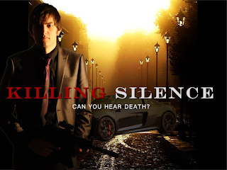


I then added a title in to the middle, to make it look better I did one word in red then the other in white, I also changed the font so it looks like it would be used to fit into the genre of the film. This was put in using the text tool.
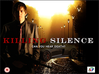


Then I added a tagline to make it stand out more and make it tell the story in one line. This was put in using the text tool.
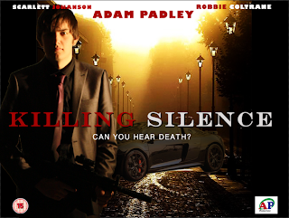


I then added the BBFC rating, which is 15 because I thought it would be violent but not too violent and not put any sex scenes in so it wouldn't be an 18. Also I made my own logo using Adobe Illustrator, which is basically my initials but the C going round the 'AP' and putting productions underneath to show it is my film


I then added my name as the main actor so it is the biggest, added 2 other well known actors, Scarlett Johanson as the main girl and Robbie Coltrane as the main bad guy leader. These were also put in using the text tool.


I then added a well know director 'Tony Gilroy' who makes one of the bourne films so he knows what sort of thing to do.


Finally I added the legal part which I got off learning box but slightly changed parts so it was part of my film, like the actors names, the director and producer etc...


This is my Final Poster

Wednesday 12 December 2012

I have made some idea's about my poster like different title names and different storylines
 These are my working titles that I wanted to choose from, the ones on the left are assassin films I wanted to choose from and on the right are an army film, I couldn't choose which one I would rather do so I gave myself an option by doing both, the title i I chose was Killing Silence or Aftermath


I then thought of some taglines to go with the films, because I had thought of titles for my assassin film and my army film I also thought of some taglines for both, the tagline I chose was 'Can you hear death?' or 'Will they find you?'


I then thought of some designs for my final idea, I drew a couple 1st and then made one on photoshop, I think my final idea will be more like the photoshop one but I will be the person with the gun.


I then wrote a storyline for each of my choices, one for my Assassin and one for my war. Just for when i write my proposal I can say what is going to happen


Finally I chose to do the Assassin film 'Killing Silence' 

Thursday 22 November 2012

20 things to do in photoshop

We got given a sheet to do 20 things to an image in Photoshop the original image is above


 This is the image with inverted colours.

 This is the image with a 'Gaussian Blur Filter'
This is the image with a 'bass relief filter'


This is the image in black and white.

 This is the image in 'photocopy'

This is the image with a different colour balance

This is the image with a motion blur.

This is the image with a film grain.

This is the image with a clone stamp.

This is the image with 'noise'

This is the image with my name using the brush tool.


This is the image with dark strokes.

This is the image wrapped in plastic

This is the image in stained glass

This is the image that part of has been erased.

This is the image with a mosaic effect


This is the image with text and a drop shadow on the image

This is the image of a diffused glow

This is the image with a lens flare

Finally this is the image inverted.


Wednesday 21 November 2012

Using Photoshop


We have started to use Photoshop to 'touch up' pictures of people, we started out on a picture we got given to us of a slightly spotty girl and told us to use different tools to make her look better. We then took a picture of ourselves and the skills we learnt we put in to the pictures of us.


This is the original picture of the girl we practiced 'touching up' and used different things to make her look better on the photograph.


This is the edited image of the girl, to make her look like this we used different tools like the 'spot removal tool' to get rid of her spots and freckles. we then duplicated the layer and gave one of the images a 'smart blur' which gave her this sort of animated effect then rubbed out important things like her eyes, mouth, eyebrow, hair and neck. Doing this made her look younger. I also made her eyes and teeth look brighter by using the brush tools but the 'lighten' effect to make them look lighter and better.


 This is the original image of myself that I took and then edited it.

This is the edited picture of me. 1st of like the practice image I used the spot healing tool. I then got rid of the background which I didn't do in the practice but knew how to do from doing it in school. I got rid of the background by using the 'quick selection tool' which selected everything around me and then I deleted it. I then got an image of Google images to put in the background then put my image in. To change the colour of myself I had to change it to black and white then add to add yellow into it slowly so then I could get it to the right shade to get it in to fit into the background.


I have used Photoshop in the past so I knew some basics but I learnt knew things like the 'smart blur' tool and the spot removal tool but I already knew how to get rid of the background. Hopefully I will learn more stuff and get better at using Photoshop.

Thursday 13 September 2012

Using adobe illustrator


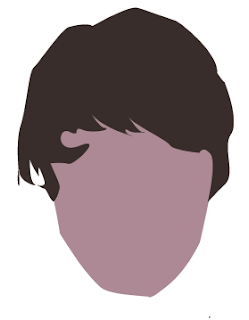
 Using Adobe Illustrator: We started off by taking a picture using 'photobooth' on the mac, then imported it into illustrator then cut out different things like my face, then used a pigment from the picture to give it a colour, i did this for every part like my hair, ear, neck, top, jacket and strings. To cut out parts of the picture you use something called the 'pen' tool, to cut it out you draw round your selected shape and curve it at parts to make it look smooth because we don't have a natural straight line on our entire body, we are made entirely of curves. Sometimes the curves didn't work so for editing the points you use the direct selection tool (the white mouse tool) to curve points if you do something wrong or if it is not exactly how you wanted it. To use a shade from your original image you use the 'eye drop' tool to choose a shade to make it look like you more.


To do this I first cut out the face by going round my face on the original picture and made that a certain colour then I went round my hair and put that as the colour of my hair then  put the shapes together and got like an animated version of my face and hair 

I found it difficult at first with the curving when making shapes because I kept on doing it wrong. Also when I was cutting out shapes I found out that the hood on my jacket is hard to do so it looks a bit rubbish.

I think I did my t-shirt quite well because I put it under my jacket so there was no gap and I did the letters on my t-shirt so it looks quite good instead of just being white. Also my hair looks good because I followed the way my hair goes and it looks good.


To improve I think I should learn how to do curves better so the jacket doesn't look as rigid and is a smooth shape and be able to do my hair 1st time


The pictures that are used in this blog is called a JPEG which is a compressed image and is usually produced by cameras as a final picture but can still be edited. But when creating the image 1st it is classed as an 'ai' file which is a unfinished image that is made using layers, for example my hair is a layer and my face is a layer whereas a JPEG is all one layer and just one image.


By Adam Padley